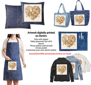
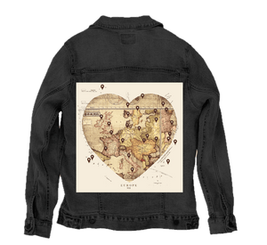
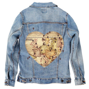
A vintage-style map of Europe arranged in the shape of a heart, rendered in sepia and parchment tones with visible creases and aged paper texture. multiple dark map pin icons mark cities across the continent, including regions of western, central, and eastern Europe. Thin grid lines, coastlines, borders, and historic cartographic labels are visible, with small inset map details at the top. The word “EUROPE” appears below the heart. This artwork is titled “Love by Travel” and created by Tobe Fonseca
You drift first
into the outline, because the heart shape is what reveals itself before the map does. Europe is not drawn as a continent here; it is folded inward, reshaped into a symmetrical heart whose curves are imperfect and human. The edges retain the irregularities of coastlines and borders, so the form never feels graphic or clean. It feels cut from history, pressed gently into a new shape without erasing its past.
As your eye settles, the surface begins to speak. The map is rendered in warm sepia, ochre, and faded brown, with visible fold lines running vertically and horizontally through the heart. These creases interrupt the geography, crossing seas and borders alike, reminding you that this object has been handled, opened, closed, carried. Fine grid lines and latitude markings remain faintly visible beneath the heart shape, anchoring the piece in old cartographic discipline.
Then come the pins. Dark location markers dot the map across multiple regions—western coastlines, central interiors, southern peninsulas, and eastern edges. Each pin sits upright, identical in shape but placed with intention, punctuating cities and routes rather than overwhelming them. They feel like moments rather than destinations: stops, memories, arrivals. No labels explain them. Their meaning is implied through accumulation.
The background beyond the heart is quieter but deliberate. Pale cream space surrounds the map, allowing the heart to float without competition. Subtle map annotations and marginal notes appear faintly at the edges, including inset circles and reference lines near the top, reinforcing the sense that this is a fragment lifted from a larger atlas.
The typography below is minimal. The word “EUROPE” sits centered beneath the heart, small and restrained, acting as a caption rather than a headline. It grounds the image without narrating it.
The entire composition is flat but layered. There is no shadow, no depth illusion beyond paper texture and ink density. The emotional weight comes from repetition, wear, and placement rather than drama.
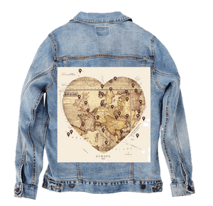
On stonewashed denim, the parchment tones soften beautifully. The sepia map sinks into the fabric grain, blending folds and ink into a single, weathered surface. Borders and grid lines blur gently, and the pins feel embedded rather than applied. The heart shape becomes less defined at the edges, as if worn down by time.
Emotionally, the piece shifts toward nostalgia. On stonewash, Love by Travel feels like a journal page carried for years—creased, familiar, and quietly meaningful.
On white denim, clarity returns. The heart shape reads cleanly, and the geography becomes easier to trace. Coastlines sharpen, borders stand out, and the pins become crisp focal points. The aged texture still shows, but now it feels archival rather than worn.
Emotionally, white denim presents the artwork as intentional and reflective—a curated map of journeys chosen and remembered, held in full light.
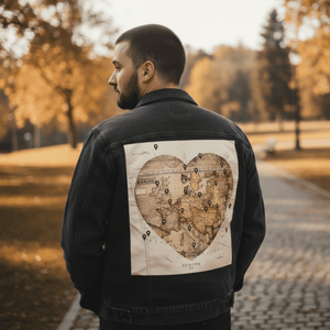
On black denim, the heart floats dramatically. The pale parchment tones glow against the dark base, and the pins become strong, almost symbolic marks. The folds feel deeper, the age more pronounced. The surrounding negative space disappears, turning the heart into an object suspended in darkness.
Emotionally, black denim transforms Love by Travel into a quiet declaration. The heart feels private and intentional—a record of places loved not for where they are, but for what happened there—held close, without explanation.