Multiple bird of paradise flowers with elongated curved stems and sharp, pointed petals in saturated watercolor hues. Orange and yellow petals radiate upward, while others shift into red, magenta, violet, and cobalt blue. Broad green leaves with white central veins fan outward around each stem. Pigment pooling and translucent washes create layered color transitions and visible brush textures against a transparent background. This artwork is titled “Bird of Paradise 1” and created by Hend Shehata
The first thing you notice is how the stems rise and bend, each one curving with deliberate tension rather than symmetry. They arc upward and outward from the lower half of the composition, their thickness subtly changing along the length. Color travels through them in gradients — emerald green dissolving into teal, then into indigo and deep violet near the joints. The watercolor sits unevenly in places, darker where pigment pooled and lighter where water thinned it out, making the stems feel wet, freshly painted, still alive with motion.
At the top of each stem, the flowers open in sharp, angular bursts. Narrow petals shoot upward like blades, some painted in hot orange and yellow, others shifting into coral red, electric pink, or cool blue. The edges are crisp in places and feathered in others, where the brush lifted and water bled outward. These blooms feel alert and upright, held in a moment just before movement. You can almost feel the resistance of the paper beneath the brush, the drag that creates those slightly uneven edges.
The leaves anchor everything. Large, oval shapes with pointed tips extend behind and between the flowers, creating a layered rhythm. Each leaf is filled with a rich green wash, darker along the edges, lighter toward the center. A single pale vein runs vertically through each leaf, with smaller angled veins branching outward. These lines are clean and confident, contrasting with the softer, more fluid color fields around them. The leaves feel steady, structural, like a quiet counterweight to the explosive blooms.
Negative space plays an active role here. The transparent background allows the shapes to breathe, separating each stem and flower so they never collapse into clutter. This openness makes the composition feel light despite the saturated color. The eye moves easily from one bloom to the next, tracing curves, following veins, lingering where colors overlap and deepen. The artwork feels suspended — not grounded in soil, but held in air.
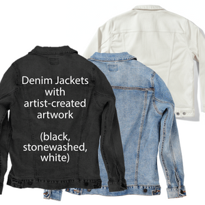
On stonewashed denim, the watercolor softens immediately. The sharp edges of the petals blur slightly as pigment sinks into the worn twill, especially where orange meets red and violet meets blue. The curved stems lose some crispness, becoming more organic and relaxed. This softening gives the piece a sense of age, like a botanical illustration that has lived with the fabric over time.
The green leaves on stonewashed denim feel quieter and more atmospheric. Their veins remain visible, but less stark, as the pale lines diffuse into the blue-gray base. Emotionally, the artwork shifts toward calm and familiarity. The flowers still feel vibrant, but no longer sharp — more remembered than announced.
As the fabric texture shows through, the watercolor blooms feel embedded rather than applied. The piece becomes gentle and wearable, carrying warmth without intensity. It feels like something you’ve owned for years, not something new.
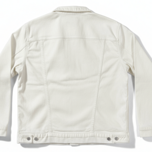
On white denim, clarity takes over. Every petal edge sharpens, and the separation between colors becomes crisp and confident. The oranges glow brightly, the blues feel clean and luminous, and the transitions along the stems read as intentional gradients rather than soft blends. The transparency of the background becomes more pronounced, giving the composition a gallery-like presence.
The leaf veins stand out clearly on white denim. Each central line and angled branch reads with precision, reinforcing the structure of the composition. The contrast between leaf and bloom heightens, making the flowers feel even more dynamic and upright. Emotionally, the artwork becomes declarative and fresh.
This clarity makes the piece feel bold and celebratory. The flowers no longer whisper — they speak clearly, with confidence and color-forward energy. On white denim, the artwork feels like a statement.
On black denim, the colors compress and glow. The oranges and yellows become molten against the dark base, while the blues and purples deepen into velvety tones. The stems appear more dramatic, their gradients intensified by contrast. The watercolor texture becomes richer, almost luminous.
The green leaves darken significantly, their pale veins glowing like etched lines. This shift makes the leaves feel closer and more intimate, as if they’re emerging from shadow. Emotionally, the piece turns cinematic, with heightened depth and mood.
The entire composition feels enclosed and focused. The flowers feel powerful and deliberate, held in a moment of tension and beauty. On black denim, the artwork becomes intimate and striking, drawing the viewer inward.
On classic blue denim, the colors find balance. The blues in the stems harmonize with the fabric, while the oranges and reds rise forward naturally. Pigment settles into the twill, creating subtle texture without losing definition. The flowers feel alive but grounded.
The green leaves interact gently with the blue base, their veins remaining visible but softened. This creates a sense of cohesion, as if plant and fabric are speaking the same visual language. Emotionally, the artwork feels steady and confident.
Classic blue denim gives the piece a timeless quality. The flowers feel neither softened into memory nor sharpened into declaration, but held in a natural, wearable presence. The artwork feels fully at home, as if it belongs there.