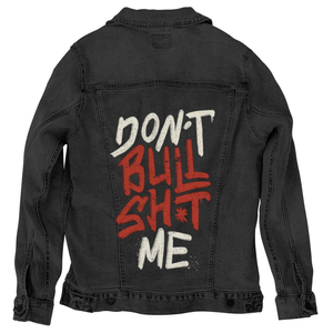
Bold hand-painted text reading “DON’T BULLSHT ME” stacked vertically on a black background. the words “DON’T” and “ME” are painted in off-white with rough, chalky texture and speckled edges, while “BULLSHT” appears in deep red with thicker brushstrokes, drips, and splatter marks. the apostrophe in “SHT” is stylized as a small starburst. This artwork is titled “Don’t Bullsht Me” and created by Tobe Fonseca
We look into the lettering, because there is nothing else to look at—and nothing else needed. The phrase stacks vertically, each word given its own weight and spacing, creating a downward rhythm that feels deliberate and uncompromising. “DON’T” sits at the top in off-white, the letters uneven and slightly tilted, edges frayed with grain and flecked texture. The strokes feel dry and abrasive, like pigment dragged across a rough surface rather than smoothly applied.
Your eye drops into the center where the tone shifts. “BULLSHT” dominates the composition in heavy red, the paint thicker and more aggressive. The letters are wider, their strokes pressing outward, with visible drips trailing from the lower edges. Speckled splatter radiates around the word, especially near the center, as if the paint carried force when it hit. The starburst symbol replacing the vowel in “SHT” is sharp and irregular, a visual rupture that adds tension rather than decoration.
Then comes the release at the bottom. “ME” returns to off-white, smaller and more compact than the red word above it. The texture matches the top line—chalky, broken, and worn—but the placement grounds the statement. It reads less like a whisper and more like a final anchor, pulling the message back to a personal boundary rather than a general outburst.
The background is absolute black. No frame, no border, no environmental context. This emptiness amplifies the text, making the negative space part of the message. The paint does not float—it confronts. Every fleck, drip, and rough edge feels intentional, emphasizing honesty over polish.
The lettering style blends street signage and protest mark-making. The uneven baselines, varied stroke thickness, and visible imperfections give the phrase a human hand and human restraint—controlled, but not softened. The message does not shout through size alone; it asserts itself through texture and contrast.
On stonewashed denim, the intensity softens into lived-in conviction. The off-white letters warm and diffuse into the fabric grain, while the red deepens into a darker, earthier tone. Drips blur slightly, and splatter embeds into the twill, making the phrase feel worn and repeated rather than freshly declared.
Emotionally, stonewashed denim shifts the piece toward quiet resolve. The message reads as something learned and carried, not newly explosive.
On white denim, clarity takes command. The off-white letters sharpen against the base, and the red becomes bold and immediate. Every drip, splatter, and grain mark is legible. The vertical stacking feels graphic and poster-like, turning the phrase into a clean, confrontational statement.
Emotionally, white denim presents the artwork as direct and unapologetic—a boundary stated clearly, without metaphor.
On black denim, the composition becomes raw and intimate. The background disappears completely, allowing the off-white and red paint to hover sharply in contrast. The red “BULLSH*T” feels heavier and more forceful, its drips and splatter glowing subtly against the darkness.
Emotionally, black denim transforms Don’t Bullsh*t Me into a private line drawn in shadow—firm, controlled, and unmistakable. The message doesn’t seek attention; it holds ground.