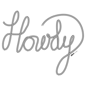
The word “Howdy” written in flowing cursive script formed entirely from thick, twisted rope. The rope letters curve smoothly from left to right, with visible spiral ridges and subtle shading that give the rope a three-dimensional, tactile appearance. The rope ends taper naturally at the beginning of the “H” and the tail of the “y,” With slight fraying visible at cut points. the artwork appears on a transparent background with no surrounding color or scene. This artwork is titled “Howdy” and created by Kitsch & Curate
The word stretches confidently across open space, unanchored to any ground or horizon. Each letter is constructed from a single continuous rope line, its thickness consistent yet alive with texture. The rope twists are tightly wound, creating diagonal ridges that catch light unevenly along the curves of the script. The capital “H” begins with a tall upward loop, the rope bending back on itself with controlled tension, while the crossbar dips gently, suggesting flexibility rather than stiffness.
As the eye moves into the “o” and “w,” the rope relaxes into wider curves. The loops open and close with smooth continuity, never breaking the line. Shadows deepen subtly along the inner curves of each letter, giving the impression that the rope lifts slightly off the surface even though no surface is drawn. The illusion of weight comes from thickness and twist alone, not from cast shadows or background cues.
The “d” rises again with a tall ascender, its loop tighter than the earlier letters, before releasing into the long, sweeping tail of the “y.” That final stroke drops downward and curves back up, ending in a soft taper where the rope appears cut or finished. Small details—minute frays, compressed fibers at bends, slight flattening where curves tighten—reinforce the sense that this is a real, manipulable material shaped into language.
Because the background is transparent, the rope lettering exists entirely on its own. There is no implied environment, no color field, no contextual clue beyond the object itself. This isolation makes the material the message. The viewer’s attention stays locked on texture, curvature, and flow, reading the word through touch as much as sight. The rope feels pulled into place, held in balance between tension and ease.
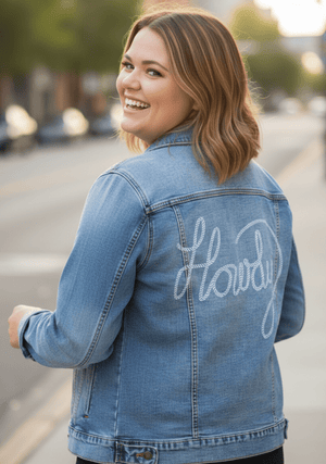
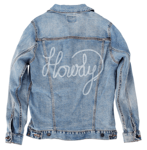
On stonewashed denim, the rope texture softens into the fabric’s worn grain. The spiral ridges lose some sharpness as pigment settles into the twill, causing the rope to feel older and more familiar. Curves blur slightly at the edges, especially in the tight loops of the “o” and “d,” giving the lettering a broken-in, well-used character.
The darker rope tone on stonewashed denim blends gently with the fabric’s mottled blues and grays. Contrast lowers, and the word feels less graphic and more embedded, as if it has always belonged there. This matters because it shifts the emotion toward comfort and approachability—the greeting feels casual, like something said slowly and often.
Overall, stonewashed denim turns Howdy into a memory rather than a declaration. The rope feels handled, worn, and friendly, its physicality emphasized through softness instead of sharp definition.
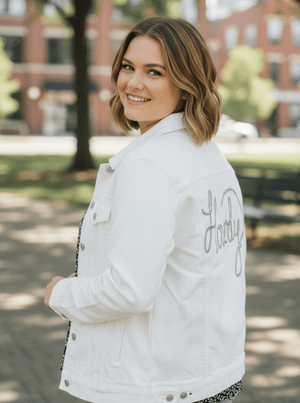
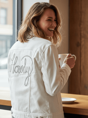
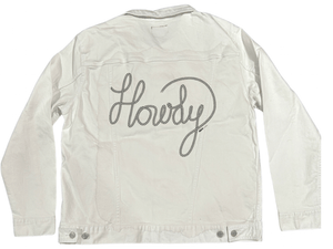
On white denim, clarity takes control. The rope’s twisted ridges become sharply legible, each spiral catching light distinctly. The edges of the lettering read clean and precise, and the negative space inside loops stays crisp. Every bend and overlap becomes intentional and easy to follow.
The contrast between dark rope and white fabric gives the word immediate presence. The script feels confident and bold, with the rope’s material qualities clearly articulated. Small details like frayed ends and compressed fibers stand out as design features rather than incidental texture.
Emotionally, white denim makes the greeting feel direct and declarative. Howdy reads as an introduction, clearly spoken and meant to be seen. This clarity matters because it foregrounds the craftsmanship of the lettering itself.
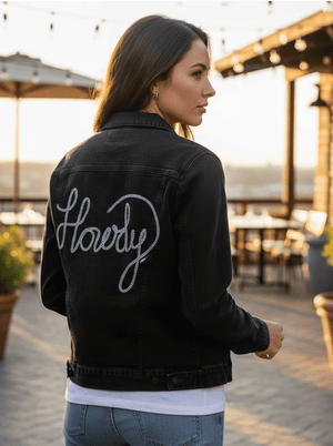
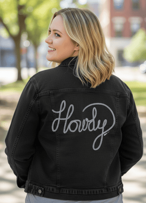
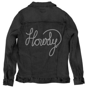
On black denim, the artwork compresses into intimacy. The rope lettering emerges subtly from the dark fabric, its highlights defining form while shadows merge into the background. The twisted ridges catch light selectively, creating a low-glow effect rather than high contrast.
The word feels quieter and more tactile on black denim. Curves are sensed before they are fully seen, and the rope’s thickness becomes the dominant cue. The long tail of the “y” feels especially fluid here, its arc revealed gradually as light moves across it.
This compression shifts the mood inward. On black denim, Howdy feels personal and understated, like a greeting shared at close range. The material presence of the rope carries the emotion, turning a simple word into a physical, intimate gesture.