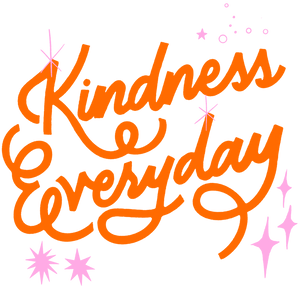
The hand-lettered phrase “Kindness Everyday” written in large flowing orange script on a black background. The lettering features thick, rounded strokes with looping curves and extended tails. Small pink starbursts, sparkles, dots, and circular accents are scattered around the words, adding decorative highlights. This artwork is titled “Kindness Everyday” and created by INDYSIGN
The composition is entirely typographic, centered on expressive hand-lettered text against a solid black background. The words “Kindness Everyday” fill most of the frame, arranged diagonally with an organic, upward flow. The lettering is bold and saturated orange, rendered in thick, rounded strokes that vary subtly in width, giving the script a hand-painted, lively appearance.
The word “Kindness” appears across the upper portion, its capital “K” large and looping, with a long, graceful tail that sweeps beneath the word. The letters connect fluidly, forming a continuous rhythm of curves and soft angles. Below it, “Everyday” stretches wider, with an oversized capital “E” and extended terminal strokes that curl and loop toward the bottom right of the frame. The script feels balanced despite its asymmetry, guided by the flow of the letterforms.
Surrounding the text are small decorative accents in pale pink. These include starburst shapes with pointed rays, four-point sparkles, tiny dots, short dashes, and small circles. The accents are scattered lightly around the lettering, concentrated near curves, endpoints, and open spaces. They do not overlap the text but instead frame it, adding visual energy without clutter.
The background remains completely black and flat, with no texture or gradient. There are no borders, illustrations, or additional symbols beyond the lettering and sparkles. The entire design exists on a single visual plane, relying on contrast, color, and motion implied through curves rather than depth.
The image is static. There is no implied movement, light source, or environment. The sense of vitality comes solely from the flowing script and the playful placement of sparkles.
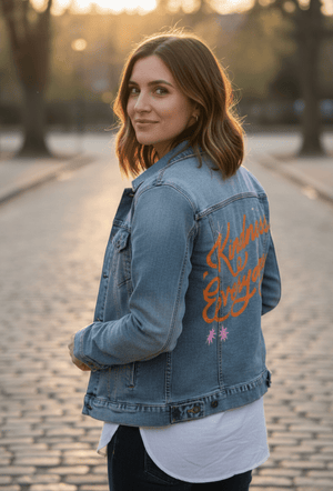
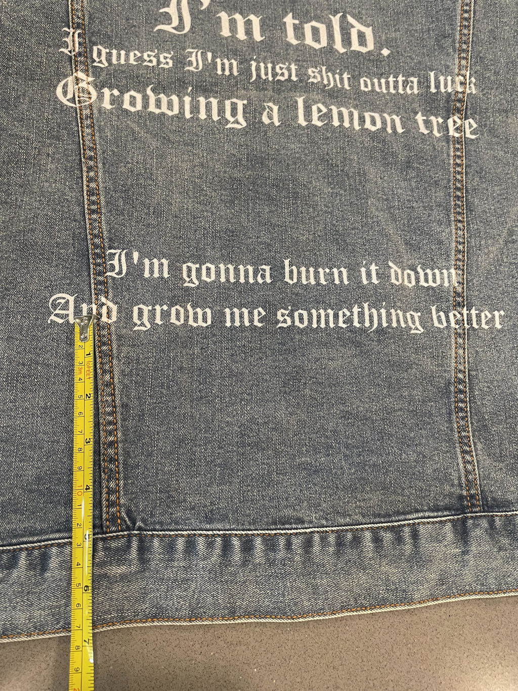
On stonewashed denim, the orange lettering softens into a warmer, sun-faded tone, and the crisp edges blur gently into the worn grain. The pink sparkles become subtler and more pastel, while the black background lifts into a deep charcoal.
Emotionally, the artwork feels relaxed and familiar, like a phrase that has been worn in over time. Stonewashed denim emphasizes comfort and ease.
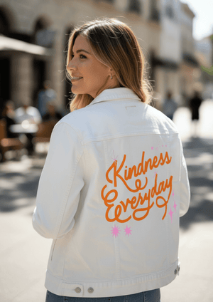
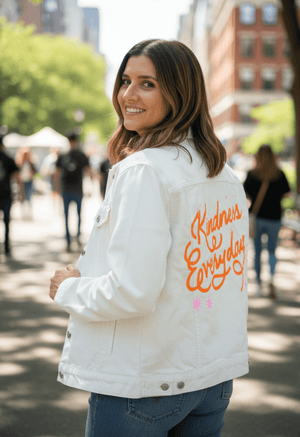
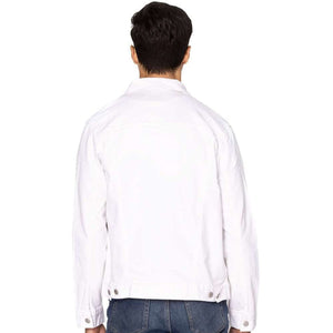
On white denim, clarity becomes pronounced. The orange script appears bold and clean, and every curve and loop reads sharply. The pink sparkles pop clearly, adding playful contrast against the light base.
Emotionally, this version feels bright and encouraging, presenting the message with clarity and confidence.
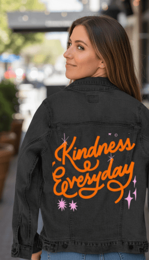
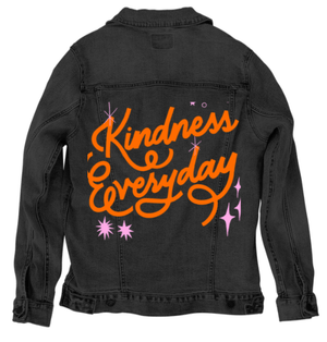
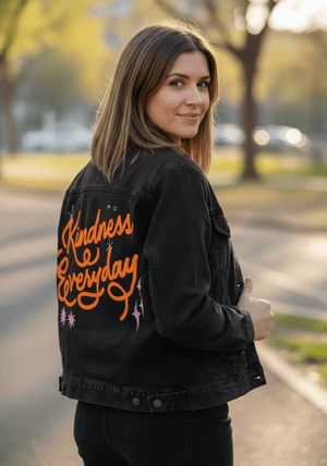
On black denim, the background merges seamlessly with the fabric, causing the orange lettering and pink sparkles to appear as if glowing directly on the garment. The sparkles become key focal accents that punctuate the flowing text.
Emotionally, the image feels bold and expressive, with strong graphic impact.
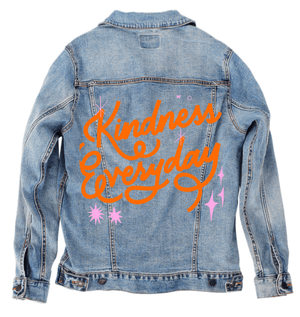
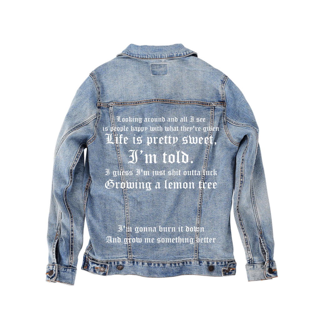
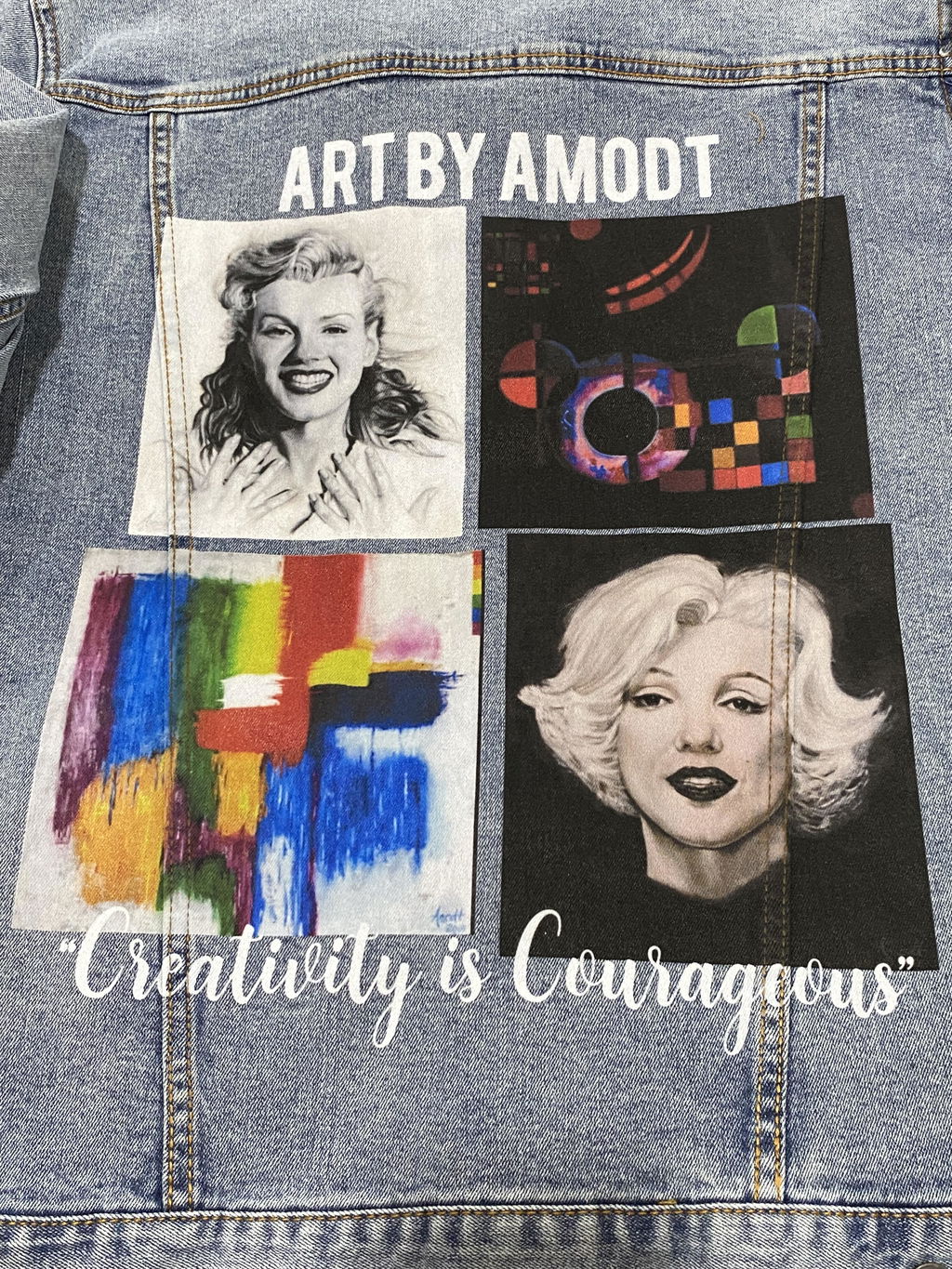
On classic blue denim, balance returns. The blue base cools the orange slightly, making the lettering feel integrated rather than loud. The pink accents remain visible but soften naturally into the twill texture.
Emotionally, this version feels timeless and wearable. The artwork settles comfortably into the denim, uplifting without excess.
Classic blue denim gives Kindness Everyday longevity, preserving its flowing typography, warm tone, and gentle decorative energy while allowing it to live naturally on the garment over time.