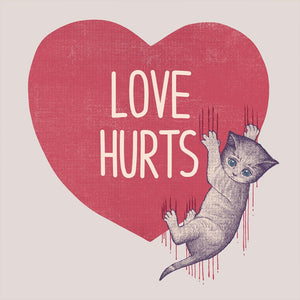
A large red heart with a textured, worn surface and cream-colored text reading “LOVE HURTS” centered inside. a small gray kitten with blue eyes clings to the right edge of the heart, paws digging in and leaving scratch marks. Thin red drips trail downward from the scratches like paint or ink. the background is solid black. This artwork is titled “Love Hurts” and created by Tobe Fonseca
You drift first
into the heart, because it fills the space with blunt honesty. The shape is full and symmetrical, colored in muted red with a soft, fabric-like grain that shows faint scuffs and wear. The surface isn’t glossy or pristine; it feels handled, pressed, and slightly faded. Centered inside, the words LOVE HURTS appear in tall, rounded cream letters, evenly spaced and calm, their neutrality contrasting the weight of the phrase itself.
Your eye moves to the right edge, where the calm breaks. A small gray kitten clings to the heart’s side, body angled diagonally downward as if slipping. Its fur is softly sketched, fine lines visible along the back, legs, and tail. The kitten’s blue eyes are wide and glossy, catching light, while the mouth curves into a subtle, uneasy expression. The paws are spread, claws extended, gripping the heart’s surface with effort rather than aggression.
Then you notice the damage. Thin vertical scratch marks tear through the heart’s edge where the kitten clings, and from these marks, red drips fall straight down. The drips are narrow and elongated, uneven in length, reading like paint or ink rather than blood. They extend below the kitten’s paws, emphasizing gravity and inevitability. The heart remains intact, but it is visibly scarred.
A shift in feeling happens when you notice how isolated everything is. The background is pure black. There is no environment, no ground, no sky—only the heart, the words, and the kitten suspended in negative space. This absence amplifies the interaction, making it feel symbolic rather than narrative. Nothing distracts from the tension between softness and pain.
The illustration style is restrained and deliberate. The typography is clean and stable. The heart is textured but simple. The kitten is the most detailed element, its small size making the damage feel disproportionate to the force applied. The contrast between the kitten’s vulnerability and the severity of the marks is what holds the image in place.
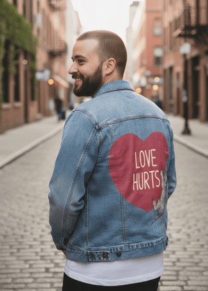
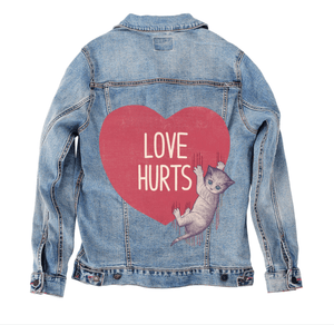
On stonewashed denim, the heart’s red softens into a dusty rose, its texture blending naturally into the worn twill. The cream lettering warms slightly, losing sharp contrast but remaining legible. The scratch marks blur at the edges, and the drips feel more like stains absorbed into fabric than fresh marks.
The kitten’s fur becomes even softer on stonewash, edges rounding, expression gentler. Emotionally, the artwork shifts toward reflection—pain that has settled, scars that remain but no longer feel raw. The image reads as memory rather than moment.
Stonewashed denim makes Love Hurts feel lived-in and honest, like something understood over time instead of learned suddenly.
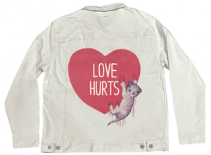
On white denim, clarity sharpens everything. The heart’s red stands bold and immediate, the lettering crisp and clean. The scratch marks cut clearly into the surface, and the drips become unmistakable vertical lines of contrast. The kitten’s blue eyes pop, drawing attention instantly.
The composition feels direct and declarative on white—no softness, no blur. Emotionally, this version reads as confrontation: the truth stated plainly, without cushioning.
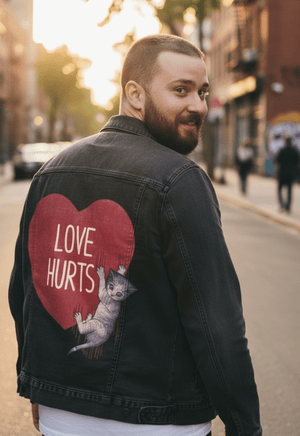
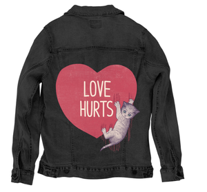
On black denim, the piece becomes intimate and heavy. The background disappears entirely, causing the heart to glow forward while the kitten and drips sink slightly into shadow. The red drips intensify, their contrast against darkness making them feel longer and more pronounced.
The kitten’s eyes become the quiet focal point, small and luminous. Emotionally, black denim transforms Love Hurtsinto a private admission—pain acknowledged without spectacle, held close, where vulnerability and honesty exist without explanation.