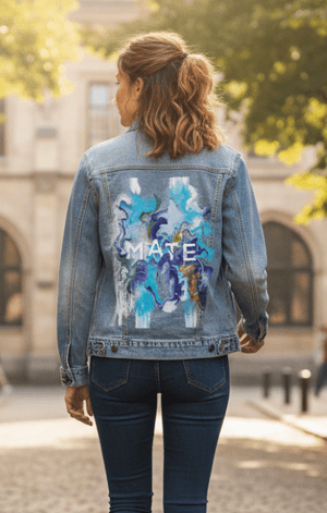
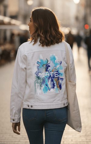
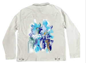
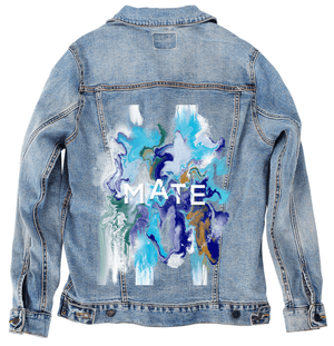
An abstract marbled composition with flowing
ocean-inspired colors including turquoise, teal, deep blue, navy, white, soft
gray, and muted gold. Liquid paint-like forms swirl vertically and diagonally
with rippled edges, layered striations, and scattered speckled texture. Bold
white capital letters spelling “MATE” appear horizontally across the center,
cutting cleanly through the fluid motion.The overall shape is organic and
asymmetrical against a black background. This artwork is titled “MATE” and
created by RaMir Designs
The
image feels poured rather than placed. Broad currents of turquoise and pale
aqua surge downward from the top, thinning into white where the pigment
stretches. Deeper blues coil beneath them, folding inward and then pushing back
out, creating pockets of density where color gathers and slows. The movement is
vertical but never straight, bending into soft S-curves and branching paths
that feel guided by gravity more than design.
Your
eye is pulled toward the center, where color compresses and intensifies. Navy
and cobalt twist together in tighter channels, bordered by pale gray and milky
white that soften the transition. Muted gold appears sparingly, not as fill but
as accent, slipping between blue layers in narrow ribbons and small pools.
These gold passages feel embedded, as if revealed by erosion rather than
applied on top.
Then
the letters intervene. The word MATE sits horizontally across the center in
stark white, its geometry calm and unmoving. Each letter is evenly spaced,
clean-edged, and opaque, refusing the marbled behavior around it. Color flows
behind the text, curls along its edges, but never crosses into the letterforms.
The typography becomes a moment of stillness inside the current, a pause carved
into motion.
A
shift in sensation happens when you notice how uneven the edges are. The
marbled mass does not end cleanly. Pigment thins and breaks into flecks along
the outer boundaries, especially at the top and lower edges, where white and
aqua fragment into mist-like scatter. Some sections dissolve abruptly into the
black background, while others hold thick, rounded contours, giving the
impression of a shape still changing.
Texture
carries the piece. Smooth, poured areas sit beside rippled striations where
pigment has been pulled into fine lines. Speckled dots appear irregularly,
especially where white meets blue, like residue left behind after movement.
There are no outlines anywhere; form exists only through contrast, layering,
and flow.
The
background remains fully black, absorbing the edges and making the color feel
suspended rather than grounded. The composition has no clear top or bottom
despite its vertical pull, allowing the viewer’s eye to loop continuously
through the currents and back across the letters.
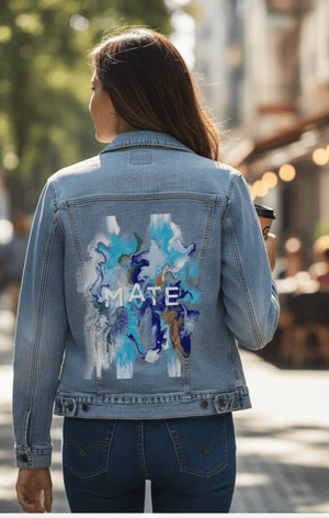
On
stonewashed denim, the oceanic palette softens immediately. Turquoise and teal
sink into the worn twill, becoming gentler and more atmospheric. Blues diffuse
at their edges, losing sharp separation as the fabric’s grain interrupts the
marbling. The gold accents warm and dull slightly, blending into the surface
rather than shimmering.
The
white MATE lettering softens just enough on stonewash to feel embedded, less
starkly imposed. Emotionally, the artwork shifts toward calm and familiarity.
The motion slows, reading like water remembered rather than actively moving.
Stonewashed
denim makes the piece feel lived-in. The flow becomes soothing, the contrast
eases, and the composition feels carried by the fabric rather than floating
above it.
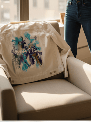
On
white denim, clarity takes control. Turquoise, blue, and navy regain their full
saturation, and every marbled boundary becomes legible. The gold accents stand
out crisply, threading through the cooler palette with precision. Ripples and
striations sharpen, making the process of the pour visible.
The
MATE text becomes a strong graphic anchor, bright and commanding. Emotionally,
white denim presents the artwork as fresh and declarative. The balance between
motion and structure feels intentional and modern, like a moment of connection
held firmly in place.
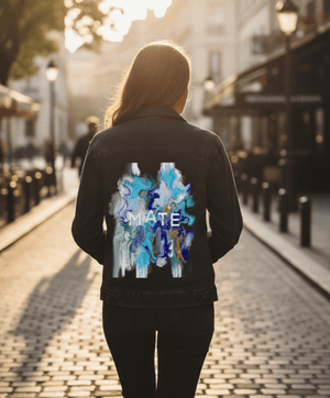
On
black denim, the composition compresses inward. Deep blues merge with the base
fabric, allowing lighter aquas, whites, and gold to rise forward dramatically.
The marbling feels deeper and more concentrated, as if viewed beneath the
surface of water.
The
white MATE letters float starkly against the darkness, becoming almost
architectural. Gold accents glow subtly, embedded within shadow. Emotionally,
black denim transforms the piece into something intimate and immersive — a
contained ocean of movement, held close to the body, with the word MATE
standing steady at its center like a quiet bond inside the flow.