A
collection of retro embroidered-style patches floating against a black
background, including a pink planet with the words “FAR OUT,” a western badge
reading “NOT MY FIRST RODEO,” a purple patch stating “SPACE GIRLS DO IT
BETTER,” a matchbox labeled “starboro,” and a shield-shaped patch with an alien
wearing a cowboy hat that reads “ROSWELL OR BUST.” All patches feature stitched
borders, textured fabric fills, and warm pink, orange, purple, and cream tones.
This artwork is titled “Patches” and created by Kitsch And Curate
You
drift first into separation rather than unity. Each patch floats independently,
spaced just enough to feel deliberate, like items laid out on a table before
being sewn on. None overlap. Each has its own shape, edge, and visual weight.
Rounded ovals, shield silhouettes, rectangles, and novelty forms coexist
without hierarchy, creating a loose constellation rather than a grid. The black
background presses everything forward, isolating each patch as its own moment.
Your
eye moves between textures. Every patch is rendered to feel stitched and
tactile, with raised-looking borders that follow each contour precisely. The
“NOT MY FIRST RODEO” patch dominates the center, its oval shape framed by thick
embroidered edging and decorative flourishes that curl inward. Lettering is
bold and padded, as if stuffed beneath fabric. Around it, the “FAR OUT” planet
patch curves smoothly, its ring slicing cleanly through the circular form,
while the purple “SPACE GIRLS DO IT BETTER” rectangle feels flatter and wider,
star motifs repeating along its edge.
Smaller
patches introduce narrative without cohesion. A vintage matchbox labeled
“starboro” tilts slightly, flanked by tiny flowers and leaves, while the
“ROSWELL OR BUST” shield features a pale green alien with large black eyes
wearing a cowboy hat, hand raised in a peace sign. The humor is visual, not
symbolic — conveyed through posture, scale, and contrast rather than story. The
emotional pulse is playful confidence. Each patch stands alone, complete,
self-contained, unapologetic.
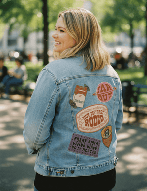
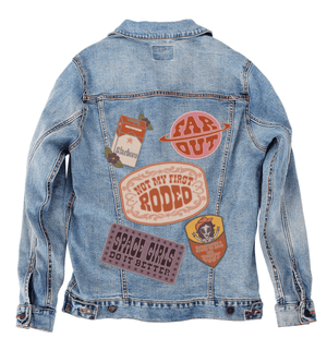
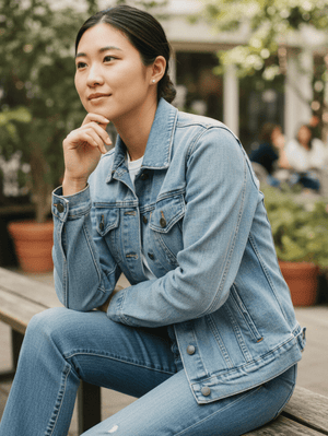
On
stonewashed denim, the first transformation is softness across all borders. The
stitched edges blur slightly as pigment sinks into the worn twill, reducing the
contrast between patch and fabric. The “NOT MY FIRST RODEO” lettering feels
especially nostalgic here, its padded forms flattening just enough to feel
well-loved rather than bold. Emotionally, the collection shifts toward memory
and familiarity.
Colors
mellow on stonewash. Pinks, oranges, and purples lose some saturation, blending
gently into the jacket’s texture. The patches feel less like statements and
more like souvenirs — objects collected over time rather than displayed
intentionally. The alien patch becomes quieter, its humor softer, its edges
less crisp.
As
a whole, the artwork on stonewashed denim feels cohesive and lived-in. The
separation between patches becomes less pronounced as fabric texture unifies
them. The emotional tone turns warm and relaxed, like a jacket that’s traveled
and gathered stories without needing to explain them.
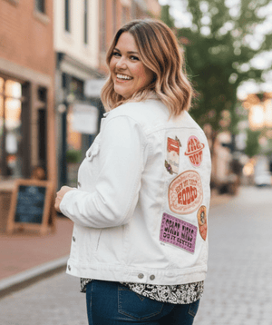
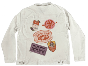
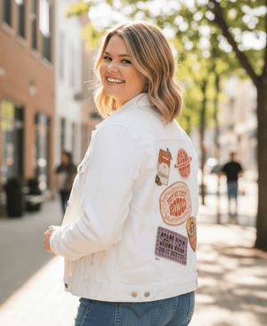
On
white denim, clarity takes control immediately. Each patch snaps into sharp
relief, with embroidered edges reading clean and deliberate. The central rodeo
patch becomes bold and declarative, its lettering crisp and graphic.
Emotionally, the patches feel confident and extroverted.
Colors
brighten significantly on white denim. The pink planet glows, the purple
typography stands out cleanly, and the orange matchbox feels graphic rather
than vintage. Each patch reasserts its individuality, and the spacing between
them feels intentional, like a curated layout rather than a collection.
Overall,
the artwork on white denim feels playful and modern. The humor sharpens, the
textures read clearly, and the emotional tone becomes expressive and outgoing.
These patches feel chosen, placed, and proudly shown.
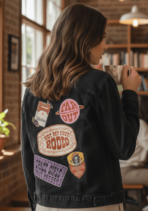
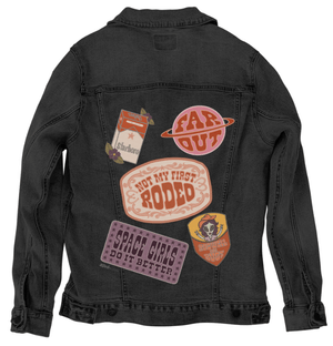
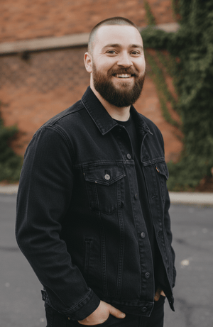
On
black denim, the artwork compresses into richness. The stitched borders glow
softly against the dark base, emphasizing their raised texture. The patches
feel heavier and closer, as if embedded rather than floating. Emotionally, the
collection becomes intimate and bold at the same time.
Warm
tones deepen on black denim. Oranges and pinks become richer, purples more
saturated, while cream backgrounds glow softly. The “FAR OUT” planet and
“ROSWELL OR BUST” alien feel especially cinematic here, their novelty
intensified by contrast rather than color alone.
As
a whole, the patches on black denim feel powerful and self-assured. The
separation between elements remains, but the darkness binds them together
emotionally. The tone shifts toward confident individuality — humor worn close
to the body, statements made quietly but unmistakably.