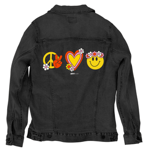
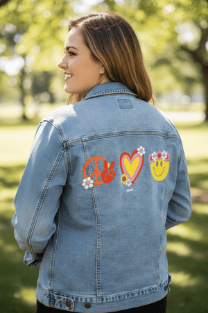
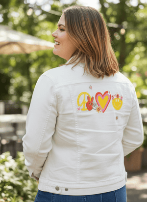
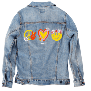
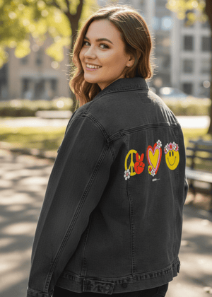
Three
retro icons arranged horizontally on a black background: a yellow peace symbol
with a red hand making a peace sign and a white daisy, a layered heart with
yellow center outlined in pink and red decorated with small flowers, and a
yellow smiling face wearing a crown of pink and white daisies. All elements are
flat, bold, and outlined in thick dark lines. This artwork is titled “Peace
Love Happiness” and created by Kitsch And Curate
You
drift first into the spacing. Three symbols sit side by side, evenly separated,
each given its own breathing room against the black background. Nothing
overlaps. The composition is horizontal and calm, like a sentence broken into
three clear words. The negative space between each icon is as intentional as
the icons themselves, allowing each symbol to stand fully on its own before the
eye moves on.
On
the left, a large yellow peace sign forms a clean circular frame. Inside and
slightly overlapping it, a red hand rises, fingers bent into a peace gesture.
The hand is rounded and simplified, its knuckles soft, its outline thick and
steady. A small white daisy with a pale pink center rests near the lower edge
of the peace sign, introducing a floral softness against the bold geometry. The
colors are flat and saturated, with no gradients, keeping the symbol direct and
unmistakable.
At
the center, a heart anchors the composition emotionally. Its interior is filled
with warm yellow, surrounded by a pink outline and then a thicker red border,
creating a layered, stacked effect. Small flowers cluster near the lower edge
of the heart, their petals white and pink with yellow centers. The heart feels
buoyant but stable, its curves smooth and symmetrical, its decoration
controlled rather than scattered.
On
the right, a smiling yellow face completes the trio. The smile is simple and
curved, eyes oval and dark, expression open and friendly. A crown of flowers
sits across the top of the head, daisies in white and pink with warm centers,
arranged like a wreath. The face is flat and iconic, but the flower crown adds
texture and rhythm, softening the simplicity with repetition. Together, the
three symbols read as a sequence — not a story, but a state of being held
steady.
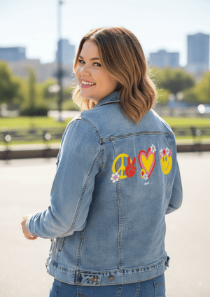
On
stonewashed denim, the first shift is softness across the edges. Pigment sinks
into the worn twill, slightly rounding the thick outlines of each icon. The
yellow tones mute gently, especially in the peace sign and smiley face, giving
them a sun-faded quality. Emotionally, the piece shifts toward nostalgia, like
a well-loved graphic carried forward in time.
The
red hand and heart outlines soften next. Their boldness relaxes as color
spreads into the fabric grain, and the flowers begin to blend slightly into
their surroundings. Individual petals remain visible, but the contrast between
shapes eases. The symbols feel less declarative and more familiar, like
something remembered rather than announced.
As
a whole, the artwork on stonewashed denim feels comforting and easy. The
separation between the three icons remains clear, but the fabric unifies them
emotionally. The tone becomes warm and personal — peace, love, and happiness
felt as enduring companions rather than bold statements.
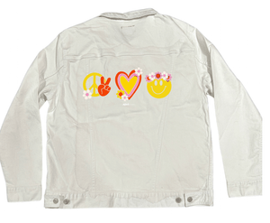
On
white denim, clarity takes control immediately. Each icon snaps into sharp
focus, with thick outlines crisp and colors bright. The yellow peace sign and
smiley face feel energetic and clean, while the red hand and heart outlines
regain their graphic strength. Emotionally, the artwork feels present and
confident.
The
flowers on white denim separate beautifully. Petals, centers, and outlines are
clearly readable, and the flower crown on the smiley face feels playful rather
than soft. The heart’s layered borders stand out distinctly, emphasizing
structure within warmth. The spacing between icons feels intentional and
balanced.
Overall,
the artwork on white denim feels joyful and declarative. The symbols read
clearly from a distance, their message immediate and open. The emotional tone
is upbeat and expressive — optimism shown plainly, without softness diluting
its impact.
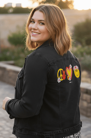
On
black denim, the composition compresses into intensity. The yellow elements
glow strongly against the dark base, especially the smiley face and the peace
sign, which feel luminous rather than flat. Reds deepen and become richer,
adding weight to the hand and heart outlines. Emotionally, the message becomes
bold and concentrated.
The
flowers on black denim pop as bright accents, their white petals glowing softly
while pink centers deepen. The flower crown feels closer to the face, more
intimate, and the heart feels heavier and more grounded. The separation between
icons remains, but the darkness binds them together visually.
As
a whole, the artwork on black denim feels confident and contained. Peace, love,
and happiness are no longer broadcast outward — they are worn close, glowing
quietly against the dark. The emotional shift is toward calm conviction,
symbols held steady and personal rather than playful display.