Stylized pink and coral flowers with five rounded petals each, connected by bright green stems and leaves, scattered across a saturated rust-orange background. The flowers are outlined with soft hand-drawn lines, and the surface shows visible crayon or pastel texture with uneven color layering and grain. This artwork is titled “Rusty Flowers” and created by Canvas & Quotations (Monika Chugh and Alka Chopra)
You can’t avoid the orange — a dense, sun-warmed field that fills the entire surface. The color is not flat; it’s worked and layered, with visible grain and pressure marks that suggest pastel or crayon pushed repeatedly across the paper. Some areas deepen into brick-red, others lift toward glowing tangerine, creating a background that feels energetic and alive rather than decorative.
The flowers emerge from that heat with quiet confidence. Each bloom is simple and open, built from five rounded petals in pale pink and soft coral. The petals are not perfectly symmetrical; edges waver slightly, and interior shapes echo the petal form in lighter tones, like impressions rather than veins. The linework is gentle and unforced, thickening subtly where curves turn, thinning toward the tips. On denim, these lighter petal fills would sink into the twill while the outlines remain readable, giving the flowers a soft structure that feels drawn rather than printed. It matters because the blooms feel approachable, not precious.
Green stems rise and bend between the flowers, painted in fresh, grassy tones that contrast sharply with the warm background. The stems curve naturally, some leaning, some crossing paths, creating a sense of growth without direction. Leaves appear intermittently — elongated, rounded, and unevenly filled — their greens shifting from bright lime to deeper olive where pigment gathers. On fabric, these greens would anchor the composition, settling deeper into the weave and grounding the warmth above.
A shift in mood happens when you notice spacing. The flowers are scattered rather than arranged. Some sit close together, others drift apart, leaving pockets of orange visible between them. This irregular spacing prevents repetition from becoming pattern; it keeps the scene playful and loose. The composition invites wandering rather than inspection.
Texture remains present everywhere. You can see where color was pressed harder, where it skipped, where paper tooth resisted pigment. On denim, these variations would translate into subtle shifts in saturation as the garment moves, making the orange background feel like it breathes. The flowers would come forward and recede depending on light and fold, reinforcing the sense of casual motion.
There is no horizon, no ground, no sky. You are inside color and growth at the same time. The simplicity is intentional — the piece does not ask to be decoded, only experienced.
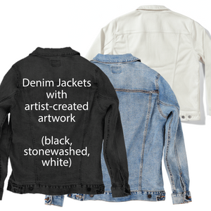
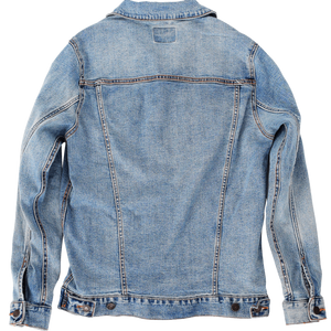
On stonewashed denim, the orange softens into a warm, worn glow. The background becomes more atmospheric, and the flowers feel like a memory of summer rather than a moment. The greens mellow, and the overall tone shifts toward comfort and familiarity.
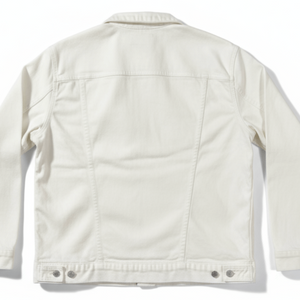
On white denim, clarity takes hold. The contrast between orange, pink, and green sharpens, and each flower separates cleanly from the background. The texture becomes more visible, emphasizing the hand-made quality. This clarity matters because it frames the artwork as joyful expression.
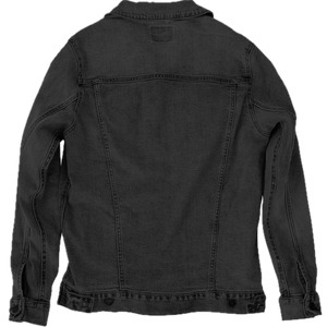
On black denim, the colors ignite. The orange glows intensely, the greens deepen, and the pink petals feel luminous against the dark base. As the fabric folds, different flowers step forward and recede, enhancing the sense of movement.
In every version, the truth remains uncomplicated and generous: color held boldly, growth allowed freely, and beauty found in simple forms that refuse to stand still.