Your Cart is Empty


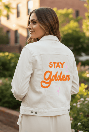
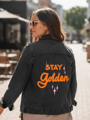
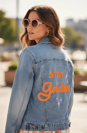
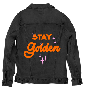
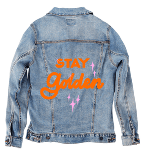
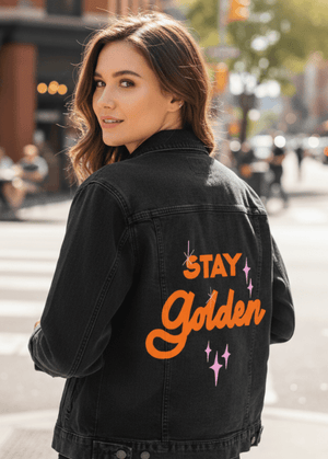
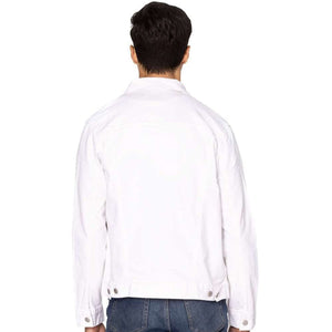


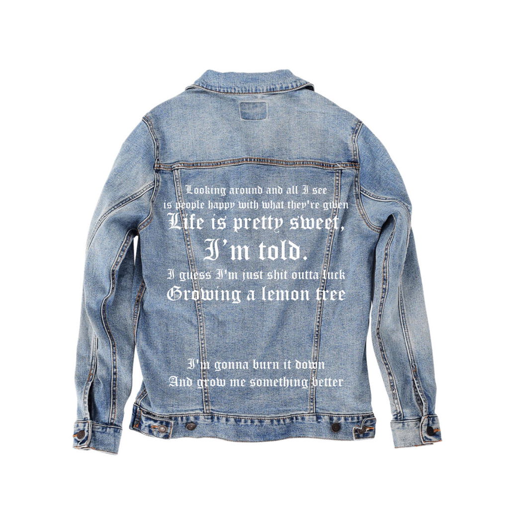

Ordered a jacket and had my private print on it. Amazing quality for both jacket and print, Excellent customer service, VERY HAPPY :)
Thank you very much. We really appreciate that, and glad you are VERY HAPPY
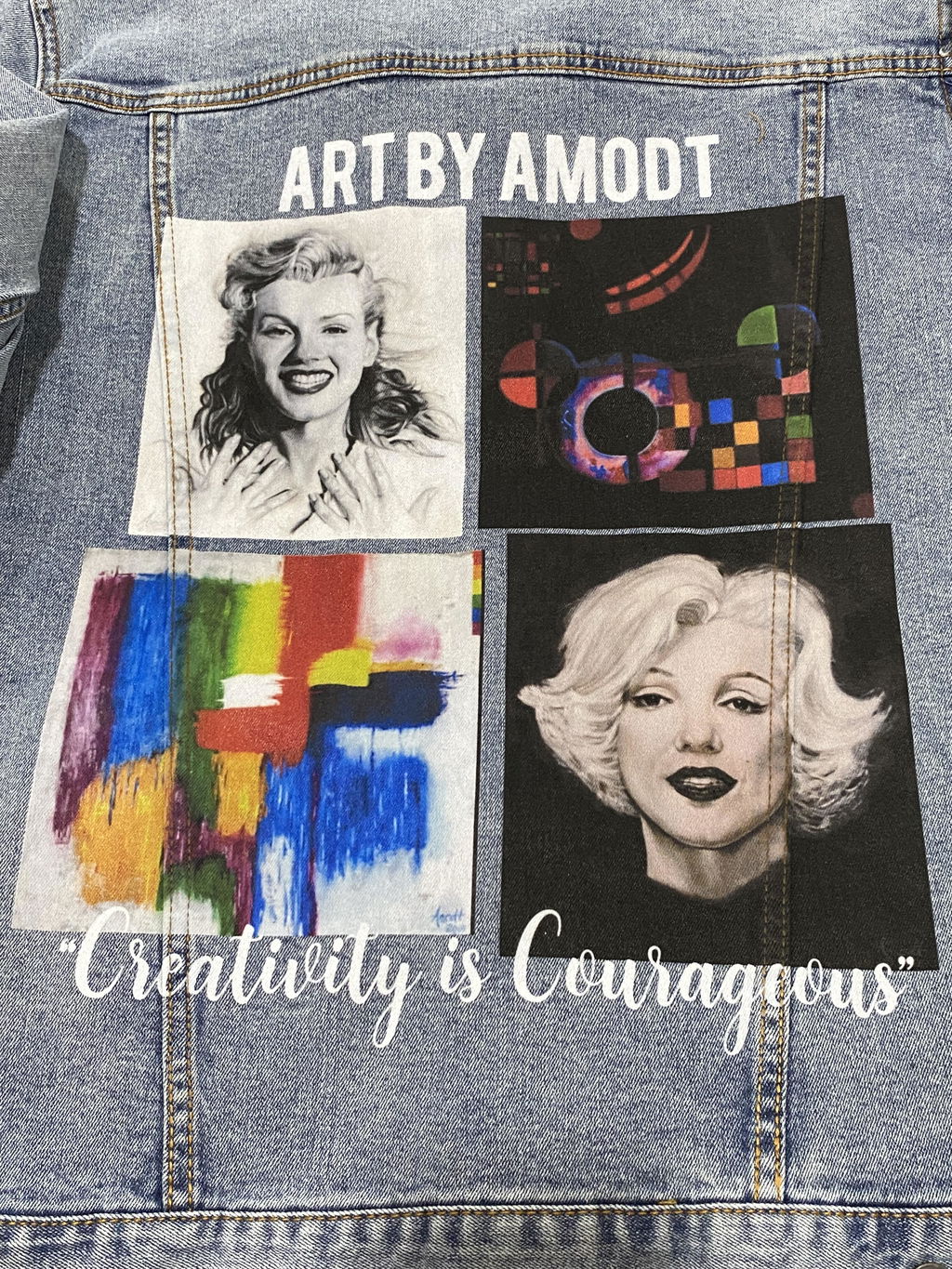
Ordered a custom blue jean jacket for my Mom with her art on it! She absolutely loves it! Seriously amazing quality, excellent customer service and super fast shipping! Vibrant colors too! If your looking for a custom jacket this is your place! Also super easy to design!
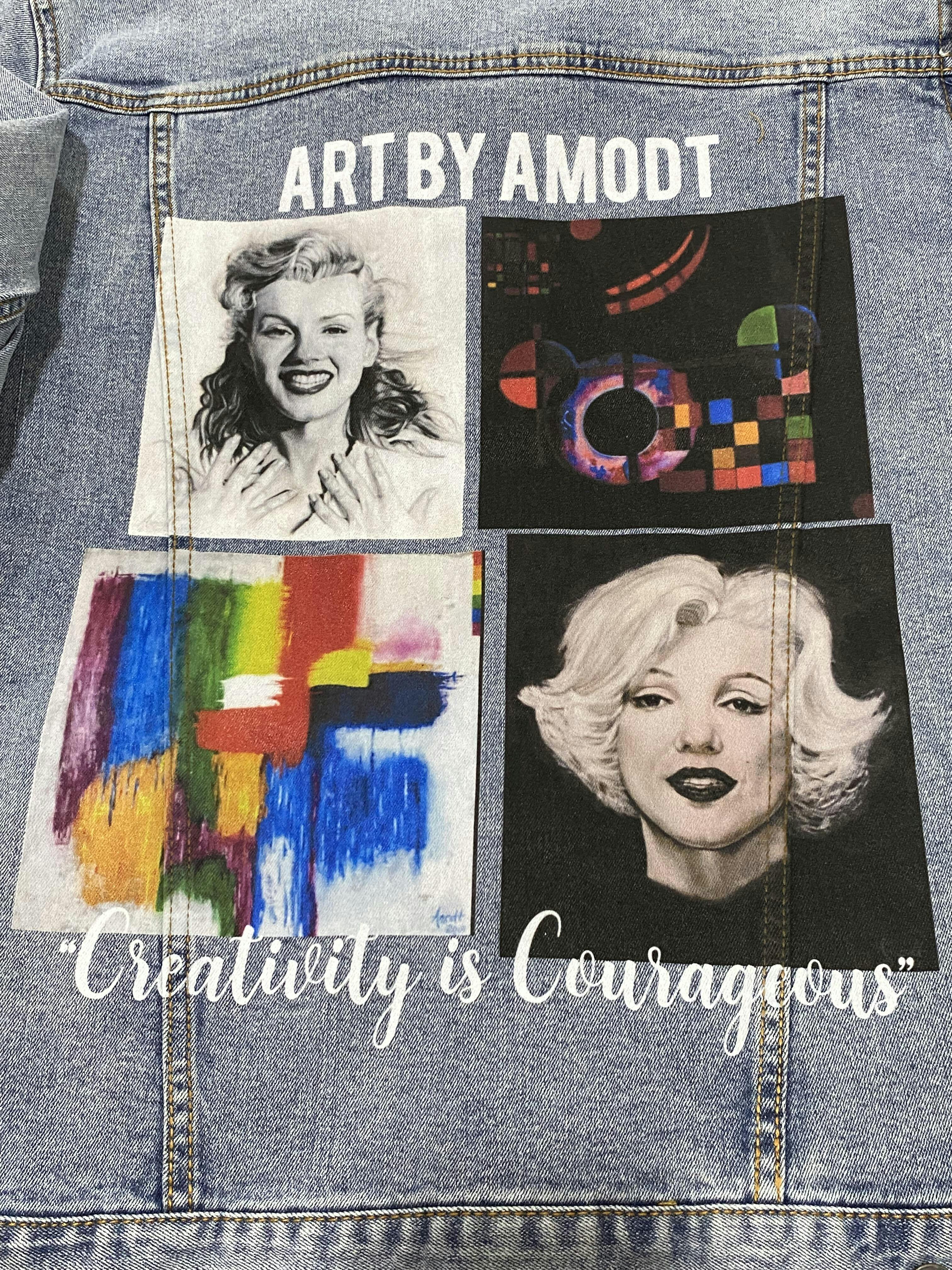
Thank you. We appreciate your comments.
So I love my jacket, it was definitely what I would consider an investment. The jacket is super nice itself but the clarity and pigment of the lettering is even more amazing. Super fast creation + delivery.
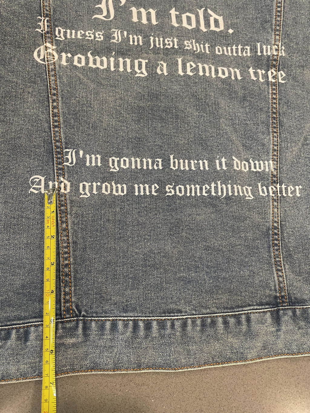
My big beef is I feel the dimensions are off from the custom online order. I really wanted the last section to be fully at the base of the jacket (which is as low as it would allow) because I had big patching plans and now I’m super disappointed because of the spaces in between being smaller and a big section below the last line. I Had lots of plans that I can’t execute now that it’s super chopped up and awkward. Posted online vs reality. I got the quality I payed for but not the dimensions unfortunately.
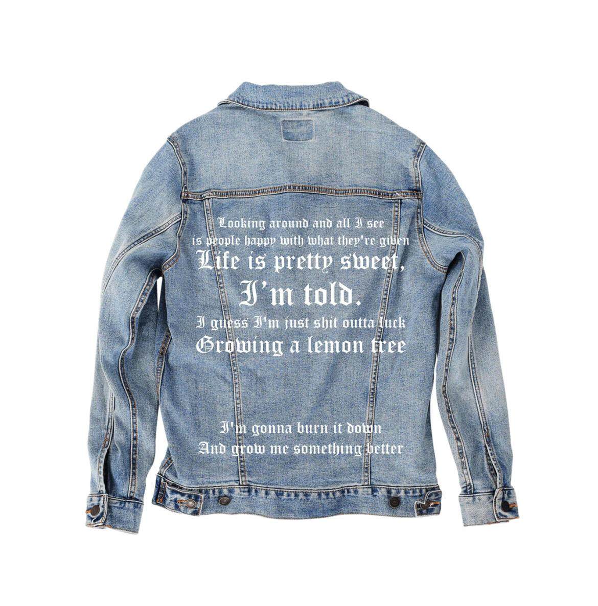
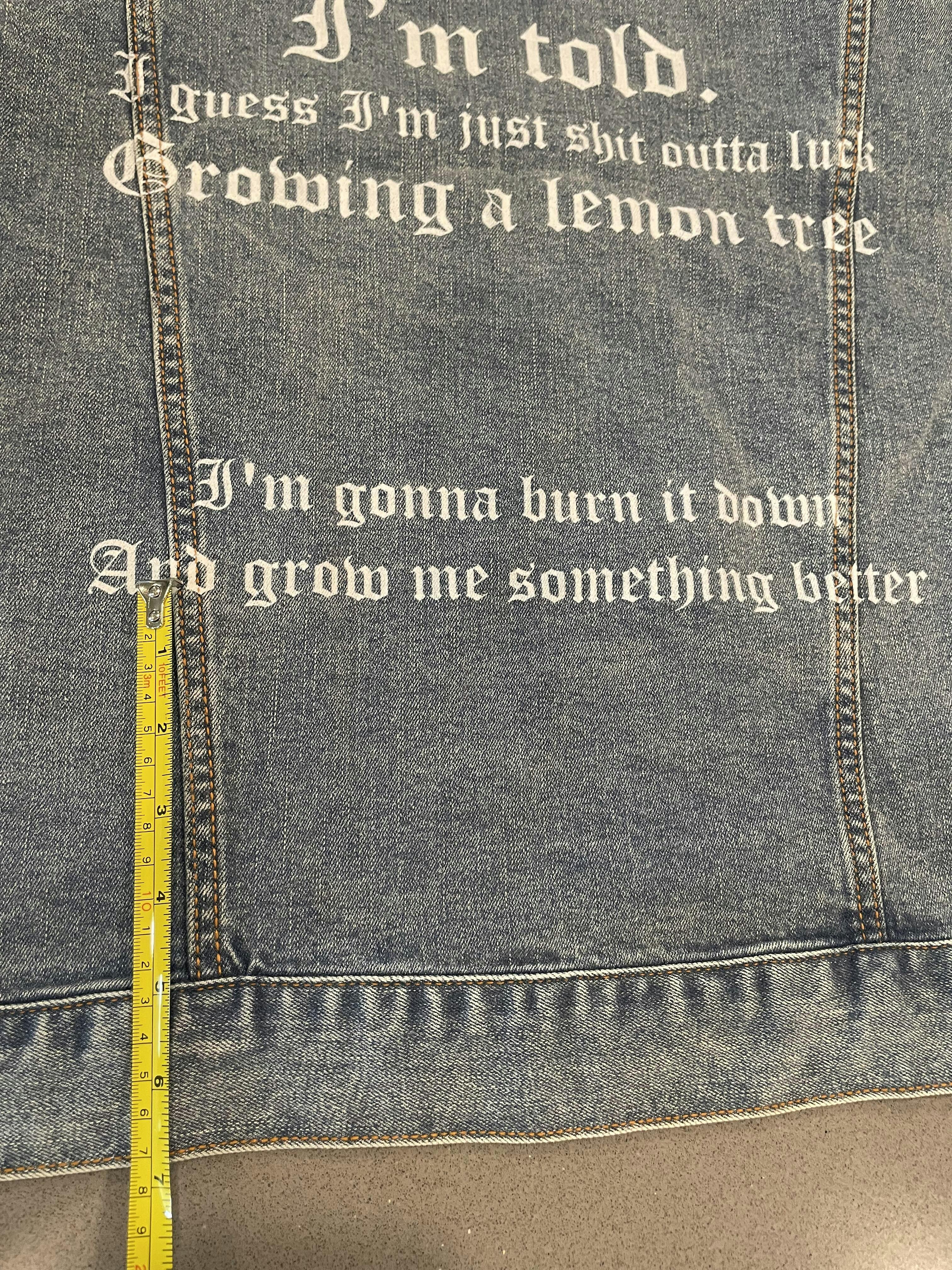
Super easy process! Put my design on back, made sure it looked, ordered it and it was here in no time! Very quick and efficient turnaround. Definitely will be back!
Thank you. We look forward to your future orders
Ordered a black denim jacket. But it doesn't really look true black. Looks like it was over-stonewashed. Looks a little too faded. Other than that, I don't really have any problems with it. Fits well. Comfortable.
Each jacket is hand made and varies in color. In the future, you can leave a note that you want a true black jacket, and we will hand pick one from the inventory.