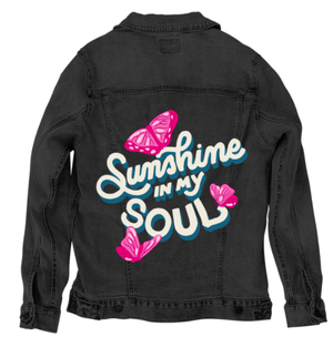
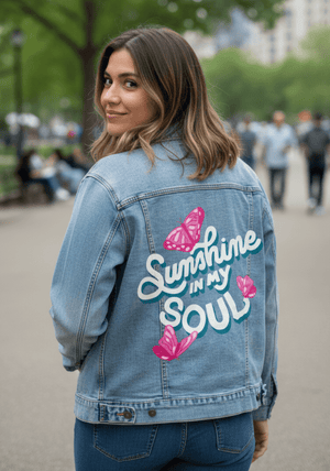
The phrase “Sunshine in My Soul” written in large cream-colored script with teal shadowing on a black background. The words are arranged diagonally with flowing, rounded letterforms. three pink butterflies with patterned wings surround the text, positioned above, below, and to the right. This artwork is titled “Sunshine in My Soul” and created by INDYSIGN
The composition is centered on expressive hand-lettered typography set against a solid black background. The phrase “Sunshine in My Soul” fills most of the frame, arranged in a dynamic, diagonal layout that moves upward from left to right. The lettering is cream-colored with bold teal drop shadows, creating a layered, dimensional look while remaining flat and graphic.
The word “Sunshine” dominates the upper portion in large, flowing script. Its letters are thick and rounded, with smooth curves and gentle variations in stroke width. The capital “S” loops broadly to the left, anchoring the composition, while the rest of the word flows seamlessly across the frame. Beneath it, the smaller words “in my” appear tucked between the larger script and the final word, rendered in a compact, simplified style that maintains readability without competing for attention.
The word “Soul” anchors the lower portion in bold, rounded letters that are slightly larger than “in my” but more grounded than the sweeping “Sunshine.” The capital “S” curls inward, and the rounded “O” and “U” forms feel weighty and balanced. The teal shadowing beneath each letter gives the impression of depth without gradients or texture.
Surrounding the text are three stylized butterflies rendered in shades of pink and magenta. One butterfly appears near the top left above the word “Sunshine,” wings open and symmetrical. Another sits to the right of the word “Soul,” angled slightly inward. A third butterfly appears near the lower left, its wings open wide. Each butterfly is flat and decorative, with simple vein patterns and white highlight shapes on the wings.
The background remains completely black and untextured, allowing the cream lettering, teal shadows, and pink butterflies to stand out clearly. There are no additional decorative marks, borders, or textures beyond the text and butterflies. Everything exists on a single visual plane.
The image is static, with no implied motion. Energy comes from the flowing curves of the lettering and the balanced placement of the butterflies rather than action.
On stonewashed denim, the cream lettering softens into a warmer off-white, and the teal shadows blur gently into the worn grain. The pink butterflies mute slightly, taking on a softer, pastel quality. The black background lifts into deep charcoal.
Emotionally, the artwork feels relaxed and nostalgic. Stonewashed denim emphasizes warmth and gentle optimism.
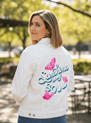
On white denim, clarity becomes pronounced. The lettering reads sharply, the teal shadows remain crisp, and the butterflies’ wing shapes and patterns are clearly defined. Color contrast is bright and cheerful.
Emotionally, this version feels fresh and uplifting, presenting the phrase with playful confidence.
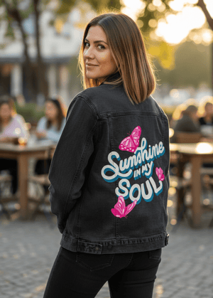
On black denim, the background merges seamlessly with the fabric, causing the cream text and pink butterflies to appear as if floating directly on the garment. The teal shadows provide strong separation and depth.
Emotionally, the image feels bold and expressive, with emphasis on typography and contrast.
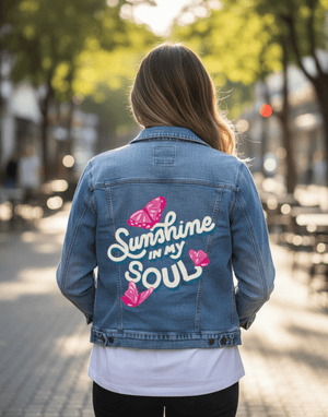
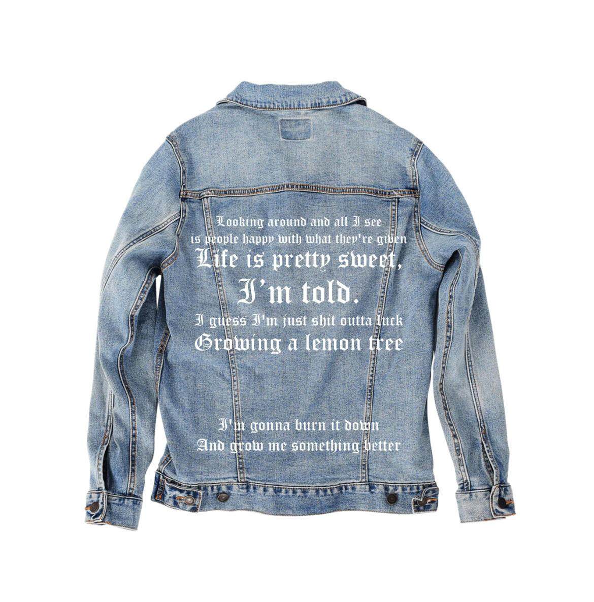
On classic blue denim, balance returns. The blue base harmonizes naturally with the teal shadows while allowing the cream lettering and pink butterflies to remain vibrant. Details remain legible but soften slightly into the twill texture.
Emotionally, this version feels timeless and wearable. The artwork settles naturally into the denim, bright and affirming without excess.
Classic blue denim gives Sunshine in My Soul longevity, preserving its joyful typography, soft color harmony, and decorative butterfly accents while allowing it to live comfortably on the garment over time.