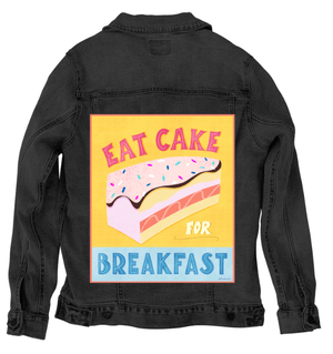
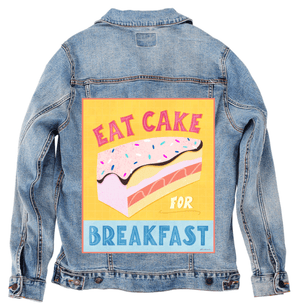
A layered slice of cake centered on a bright yellow background with a faint grid texture. the cake has multiple pastel layers in pink, cream, peach, and pale yellow, topped with pink frosting edged in dark chocolate and scattered with colorful sprinkle shapes. Above the cake, the words “EAT CAKE” appear in large pink block letters. below, the words “FOR BREAKFAST” are stacked, with “FOR” in small yellow letters and “BREAKFAST” in large blue block letters. The background is fully colored, not transparent, with a thin pink border framing the artwork. This artwork is titled “Eat Cake for Breakfast” and created by thearticsoul
The composition is bold and graphic, framed cleanly within a rectangular border that immediately sets it apart from the floating works before it. The yellow background fills the entire field, textured with a subtle grid that gives the surface a soft, tactile rhythm rather than a flat plane. The grid is consistent but faint, allowing the cake and lettering to remain dominant while grounding everything in structure.
At the center sits a generous slice of cake, angled slightly so its layers are fully visible. The frosting on top is pale pink, thick and uneven, with a dark chocolate line tracing its lower edge like a drip caught mid-fall. Sprinkles scatter across the frosting in oblong shapes of blue, white, teal, and pink, spaced irregularly so they feel playful rather than patterned. The cake layers beneath stack in soft bands—cream, peach, blush, and pale yellow—each separated by clean edges that read clearly through color contrast rather than line.
Typography anchors the message. “EAT CAKE” arches across the top in oversized pink block letters with visible grain and internal texture, each letter slightly irregular, as if cut by hand. Below the cake, “FOR” appears small and bright, followed by “BREAKFAST” in large blue letters that stretch across the width of the image. The lettering feels weighty and intentional, balancing the visual sweetness of the cake with graphic authority.
Color does most of the emotional work. The palette is warm and cheerful—yellows, pinks, and blues held in balance by the grounding chocolate brown line. Texture appears everywhere: in the frosting’s speckle, the cake’s soft grain, and the background grid. Nothing is glossy or polished; everything feels matte and tactile, like paper or fabric rather than icing or porcelain.
On stonewashed denim, the yellow background softens immediately. The grid texture sinks into the worn twill, becoming more atmospheric than structural. Pink lettering and frosting blur slightly at the edges, and the chocolate line loses some sharpness, feeling more like a warm shadow than a crisp border.
The cake layers blend gently on stonewashed denim, their boundaries less rigid. Sprinkles become quieter, reading as texture rather than individual shapes. This matters because the artwork shifts from bold declaration to nostalgic comfort—the message feels remembered, like a well-loved poster faded by time.
Emotionally, stonewashed denim turns Eat Cake for Breakfast into a gentle indulgence. The piece feels cozy and familiar, less rebellious and more reassuring, like permission given softly rather than shouted.
On white denim, clarity takes full control. The yellow background brightens and the grid becomes clearly legible, framing the composition with precision. Letterforms sharpen, and the pink and blue typography reads immediately and confidently.
The cake layers separate cleanly, and the dark chocolate edge becomes crisp and graphic. Sprinkles pop as playful accents. This clarity matters because it amplifies the humor and intent—the message feels bold, joyful, and unapologetic.
Emotionally, white denim presents Eat Cake for Breakfast as a confident statement. The artwork feels fresh, energetic, and meant to be seen head-on, like a cheerful rule-breaker pinned proudly in place.
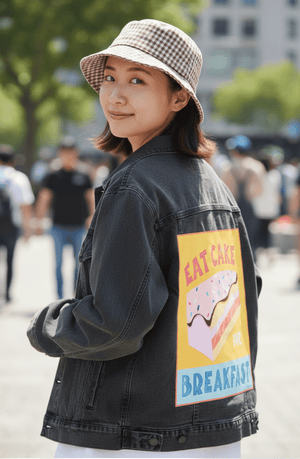
On black denim, the composition compresses inward. The yellow background deepens toward gold, glowing against the dark fabric. Pink frosting and lettering lift forward, while the blue “BREAKFAST” becomes rich and saturated.
The grid texture recedes, allowing color blocks to dominate. The cake feels heavier and more decadent here, with layers defined through light rather than line. This compression creates intimacy—the humor becomes slightly conspiratorial, like a secret shared.
On black denim, Eat Cake for Breakfast feels indulgent and cinematic. The piece glows warmly, turning playfulness into a cozy, late-night thought rather than a morning proclamation.
On classic blue denim, balance settles naturally. The yellow background harmonizes with indigo, remaining bright without overwhelming the fabric. The grid texture stays visible but relaxed, integrating smoothly with the twill.
Pink lettering and frosting feel warm and approachable, while the blue “BREAKFAST” echoes the denim base, tying text and fabric together. The cake layers remain legible, and sprinkles stay playful without becoming busy.
Emotionally, classic blue denim gives Eat Cake for Breakfast an everyday confidence. The artwork feels wearable and natural, like joy folded into routine rather than treated as an exception. This matters because it turns indulgence into something casual—sweetness allowed, woven quietly into daily life.