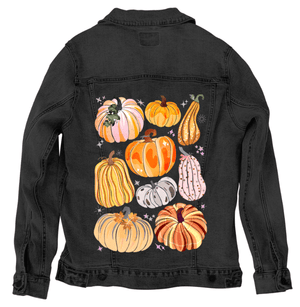
Multiple decorative pumpkins and gourds arranged across open space, each rendered in soft autumn colors including peach, orange, yellow, cream, blush pink, and muted gray. The pumpkins vary in shape and size, with ribbed surfaces, curved stems, and layered painted textures featuring dots, stripes, and subtle speckling. Small star and sparkle shapes in pale pink and cream are scattered between the pumpkins. The background is transparent with no visible ground or color field. This artwork is titled “Pumpkins Galore” and created by thearticsoul
The composition spreads outward rather than centering itself. Each pumpkin occupies its own pocket of space, arranged loosely but deliberately so that no two forms compete. Shapes range from squat and rounded to tall and elongated, with ribbing that curves inward and outward in uneven rhythms. Stems bend and twist naturally, some thick and short, others long and curling, painted with darker browns and greens that anchor each form visually.
Color layering defines the surface of every pumpkin. Soft peach blends into warm orange, pale yellow slides into cream, and muted pinks sit beside gentle gray. These transitions are not smooth gradients but built from layered strokes and grain, allowing undercolors to show through. Dots, stripes, and subtle patterning appear within the ribs, giving each pumpkin its own personality without breaking cohesion across the group.
Texture is everywhere. Speckling floats across surfaces like fine dust, especially visible in lighter pumpkins. Some pumpkins carry faint decorative motifs—small leaf shapes, dotted accents, or tonal striping—that stay contained within their rib structure. The sparkles and star shapes between pumpkins punctuate the space lightly, never overpowering the forms, but keeping the composition playful and buoyant.
There is no setting. No ground, no sky, no seasonal cues beyond color and shape. The pumpkins exist in suspension, turning them into objects of pattern rather than harvest. The absence of background pushes attention inward, toward surface, color, and repetition. The mood is celebratory but calm, decorative without becoming busy.
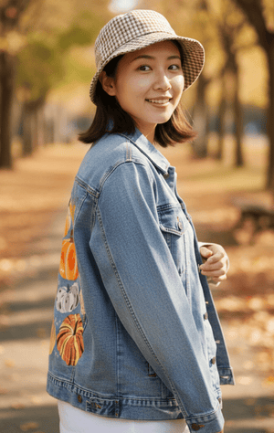
On stonewashed denim, the pumpkins soften into warmth. The layered peach and orange tones diffuse into the worn twill, blurring the edges between ribs and reducing contrast in the stripes and dots. Speckling becomes more atmospheric, sinking into the fabric rather than sitting on top of it.
Lighter pumpkins—cream, blush, and pale yellow—take on a mellow, almost sun-faded quality. Decorative sparkles quiet down, becoming subtle texture rather than visual punctuation. This matters because the artwork shifts toward nostalgia, like seasonal decorations brought out year after year.
Emotionally, stonewashed denim makes Pumpkins Galore feel familiar and lived-in. The pumpkins feel handled, remembered, and gently worn, emphasizing comfort over brightness.
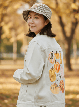
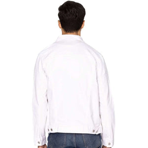
On white denim, clarity brightens the entire composition. Each pumpkin separates distinctly, and ribbing becomes crisp and legible. Dotted textures and stripe patterns read clearly as intentional design, giving each form a graphic presence.
The lighter pumpkins glow against the white base, while oranges and yellows feel fresh and cheerful. Sparkle shapes pop cleanly, adding lightness without clutter. This clarity emphasizes variety—each pumpkin stands confidently on its own.
Emotionally, white denim presents Pumpkins Galore as celebratory and playful. The artwork feels fresh and decorative, like a curated collection meant to be seen and enjoyed immediately.
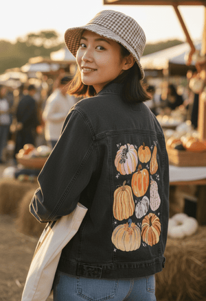
On black denim, the pumpkins compress and deepen. Warm oranges and yellows glow richly, while blush and cream tones become more dramatic by contrast. Ribbing reads through light rather than line, giving the pumpkins a rounded, dimensional feel.
Patterns soften into suggestion as darker areas merge with the background. Sparkles appear like faint points of light, scattered quietly between forms. The pumpkins feel closer together, more intimate, as negative space tightens around them.
This compression creates a cozy, cinematic mood. On black denim, Pumpkins Galore feels rich and inward, emphasizing warmth, glow, and quiet abundance.
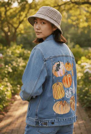
On classic blue denim, balance settles across the composition. The indigo ground supports both warm and cool pumpkin tones, allowing oranges and yellows to feel vibrant without overpowering lighter creams and pinks. Ribbing remains visible, and layered textures sit comfortably within the twill.
Decorative dots and stripes integrate naturally, neither dissolving nor becoming too sharp. The pumpkins feel grounded rather than floating, as if placed into everyday wear instead of display space. Sparkles remain visible but restrained.
Emotionally, classic blue denim gives Pumpkins Galore an everyday ease. The artwork feels wearable and familiar, like seasonal joy woven into daily life rather than reserved for a moment. This matters because it turns abundance into something approachable, repeated, and quietly joyful.