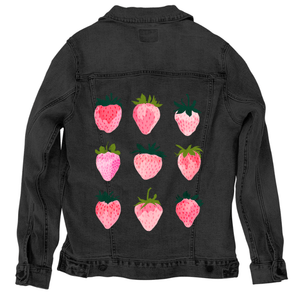
Nine stylized strawberries arranged in a three-by-three grid, each fruit rendered in soft pink and red tones with visible grain and speckled texture. Each strawberry has a unique shape and pattern of small oval seeds, with leafy green tops varying in size, direction, and shade. Highlights appear as lighter pink patches across the fruit surfaces. All strawberries are evenly spaced against a transparent background with no visible ground or color field. This artwork is titled “Strawberry Dreams” and created by thearticsoul
The composition is orderly but not rigid. Nine strawberries float in open space, aligned into a loose grid that values variation over symmetry. Each fruit occupies its own pocket of air, separated just enough to be read individually. No two strawberries are the same. Shapes shift subtly—some fuller and rounded, others elongated or tapered—creating rhythm through difference rather than repetition.
Color lives in layers. The strawberries are built from overlapping washes of pale blush, warm pink, and deeper red, with lighter patches drifting across their surfaces like soft highlights. Seeds appear as small, uneven ovals scattered across each fruit, darker and denser toward the centers, lighter at the edges. The paint texture is visibly grainy, with speckles breaking through the color fields, preventing any surface from feeling flat.
The leafy tops vary dramatically. Some crowns are deep teal-green and compact, others lighter olive and more open, their pointed leaves stretching outward in different directions. The leaves are painted with thicker pigment than the fruit, giving them visual weight and grounding each strawberry from above. Stems appear occasionally, thin and curved, introducing vertical accents without disrupting the grid.
Negative space does important work here. With no background color or setting, the strawberries feel suspended rather than placed. The eye moves easily from one to the next, comparing shapes, tones, and textures. The repetition creates calm, while the variations keep attention active. The artwork feels playful but controlled, decorative yet tactile.
Emotion comes from softness rather than narrative. These strawberries are not hyper-realistic; they feel imagined, handled, and painted slowly. The grain and speckling suggest touch, like fruit seen through memory rather than direct observation. The grid becomes a quiet meditation on small differences held together.
On stonewashed denim, the strawberries soften into warmth. The pale pink highlights spread gently into the fabric’s worn twill, blurring edges between color layers. Seeds become less distinct, reading more as texture than detail. Each fruit feels slightly faded, as if seen after time in the sun.
The green leafy tops mute subtly on stonewashed denim, their darker tones blending into the blue-gray weave. Contrast lowers, and the grid feels less structured, more organic. This matters because the repetition becomes comforting rather than graphic.
Emotionally, stonewashed denim turns Strawberry Dreams into nostalgia. The strawberries feel remembered—sweet, familiar, and gently worn—like an image that has lived with you rather than one freshly printed.
On white denim, clarity sharpens every form. The pinks and reds become brighter, and the lighter highlight patches read clearly as intentional paint layers. Seeds regain definition, dotting each strawberry distinctly and evenly.
The green leaves pop crisply against white, making each crown feel fresh and lively. Spacing between the strawberries feels precise, and the grid structure becomes more apparent. This clarity emphasizes individuality—each strawberry stands confidently on its own.
Emotionally, white denim gives the artwork a cheerful, declarative energy. Strawberry Dreams feels bright and playful, like a pattern meant to be noticed and enjoyed immediately.
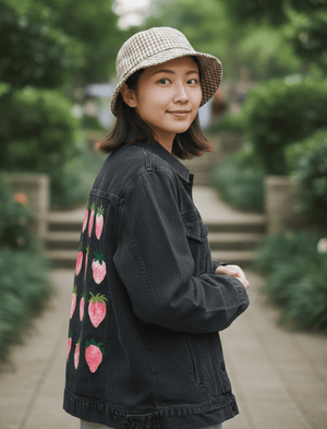
On black denim, the strawberries glow inward. Light pink areas lift dramatically from the dark fabric, while deeper reds sink and intensify. Seeds appear more subtle, sometimes dissolving into shadow, giving the fruit a smoother appearance.
The leafy tops deepen in tone, their edges defining form through contrast rather than outline. The grid tightens visually, and the strawberries feel closer together, more intimate. The repetition becomes hypnotic rather than decorative.
This compression creates a dreamy mood. On black denim, Strawberry Dreams feels indulgent and intimate, like color emerging slowly from darkness, emphasizing richness over detail.
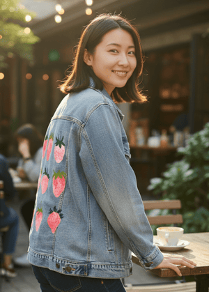
On classic blue denim, balance settles in. The indigo ground supports both the warm pinks and the green leaves, allowing contrast without extremes. Highlights remain visible, and seed textures stay legible without overpowering the surface.
The strawberries feel grounded here, less floating and more integrated. The grid reads clearly, but the denim weave introduces subtle variation that keeps the pattern from feeling rigid. Greens harmonize naturally with the blue base, reinforcing cohesion.
Emotionally, classic blue denim gives Strawberry Dreams an everyday charm. The artwork feels wearable and natural, like a familiar pattern encountered casually. This matters because it places sweetness into daily life—present, repeated, and quietly joyful rather than precious.